
When I started this blog, I published mostly my creative digital work, and I hadn’t created anything fun recently, until today! If you weren’t aware, I work for a newspaper and magazine, The Racing Pigeon, in production. With christmas coming up, that means we’ve been getting some christmasy articles to put in the paper, and even some poems. In order to make the issue even more festive, I decided to create some decorative graphics to frame the poems. As I’ve mentioned before, I’ve been becoming more and more confident with using Adobe Illustrator and the rest of the Creative Suite, so created this using Illustrator and Photoshop. The final outcome is what you see above, however I will talk through the process.
The first step was to create the individual items, I started with the big bauble in illustrator. Initially I just needed to create the base shape of the bauble. I started with an oval, and adjusted the anchors to create the desired shape. I then added a separate coloured bar across the bauble as the base for the decoration. A little pink hook was added too.
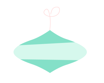 From this stage, the next thing I had to do was add texture to the bauble, I did this by using a chalk artistic brush stroke in illustrator. I chose colours similar to the base colours to make it subtle, but noticeable.
Next was the decoration, I went with a small and simple curly pattern with coloured dots. I liked the simplicity of this choice. This completes the first bauble! 
Following this, I simply replicated this bauble but in the opposite colour scheme, I simply copy and pasted the design, and re picked the colours.

So after one bauble, comes the next! I followed similar steps to create this one, but moving anchors in different ways and using different shapes. This one is more of a long oval start than a wide one. I followed a similar colour scheme to the others, also. Following the base shape, texture was added by the same method as previous, and the pink hook!


Now it’s time for decoration again, this time I went for more of a star shape, with coloured dots again too! And that’s the second bauble complete.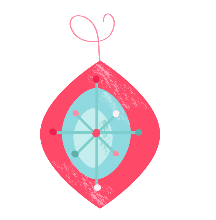
Similarly, I then duplicated this bauble with the opposite colour scheme!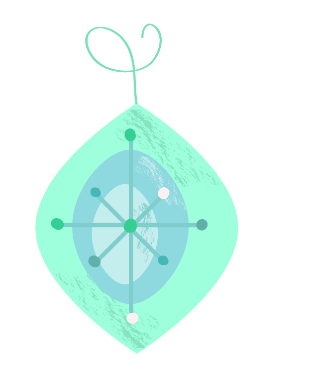
Another christmasy decoration that I felt should be included was bells, so I tackled that next! I started with a simple base shape of a circle (for the top) and a rectangle (for the main body of the bell), combining them to one shape. I then adjusted the anchors to make it more of a ‘bell shape’.
I then added a bit of shading and texture to give the bell a more 3D and realistic appearance, although not too realistic! I did this by copying the main shape, and cutting it down to a small strip, I then picked a darker shade of golden yellow to make it look like a shadow. The texture was added using the same method as previous, a chalk artistic brush in illustrator with a similar shade. 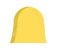 Following this, the middle ‘ball’ of the bell was added, shaded and textured, then a bow was added to the top. The bow was created using a calligraphy brush stroke, this then also had a texture added, using the same method.
The final outcome is as seen below!

The final element I wanted to add to this decorative boarder was something traditionally christmasy, a candy cane! I created the base shape of this with the lines from a circle and a line, I then combined these and eliminated the bottom part of the circle. To create the stripes I duplicated the shape, made one a very light shade of pink and one a much darker shade.
 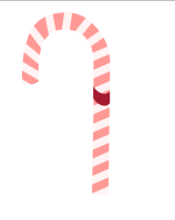 I then eliminated rectangular strips from the darker shape and layered it on top of the lighter one.
Following this I wanted to add a cute bow, as candy canes are often tied to the christmas tree or presents. I did this again using a calligraphy brush stroke, however added more shading to this one than the previous one, simply by changing the colour of my brush to a darker shade where shadow would naturally be.
The next task was to organise all of these bits into a pattern I was happy with as a boarder. I duplicated some in order to fill the space desired. 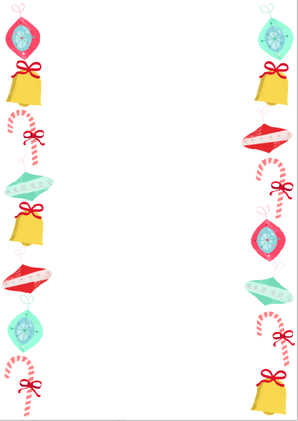
Lastly, I made the background, I simply filled the background layer with a peppermint shade of blue/green, and shaded the outer edges with a really light shade of blue scatter brush, to look like snow on the edges. Ta-Da!

I am so happy with how this turned out, and couldn’t be prouder of myself for making it. The icing on the cake really is that this is going to be published in the christmas issue of the paper, along with one of the writers poems.
How wonderfully festive!

December 18, 2015 at 2:02 pm
Brilliant! Love it 🙂
LikeLiked by 1 person
December 18, 2015 at 2:09 pm
Thank you!!
LikeLike
December 19, 2015 at 1:47 pm
Jade! I didn’t know you like full on made it! I would have been so much more proud and excited for you if I had of known that! I can’t believe you literally made every aspect of that! Well done! That’s amazing! You should print your name on it and put it on google, people would have to reference your name in their work 😉 FAMOUS! x
LikeLiked by 1 person
December 19, 2015 at 1:52 pm
Aww you! What did you think I had done?! Just found images and made it a boarder?! Despicable! Thank you though! xx
LikeLike
December 19, 2015 at 1:53 pm
LITERALLY THAT! So apologies for my like non existent enthusiasm ahah and no problem! Well done! It’s sick! Smarty pants xx
LikeLike
December 19, 2015 at 5:00 pm
You did an amazing work!♥
http://www.brooklynglam.com
LikeLiked by 1 person
December 19, 2015 at 9:22 pm
Thank you so much! xx
LikeLike